BRANDING & LOGO DESIGN
LOGO & BRAND DESIGN
ELEMENT BRICKS
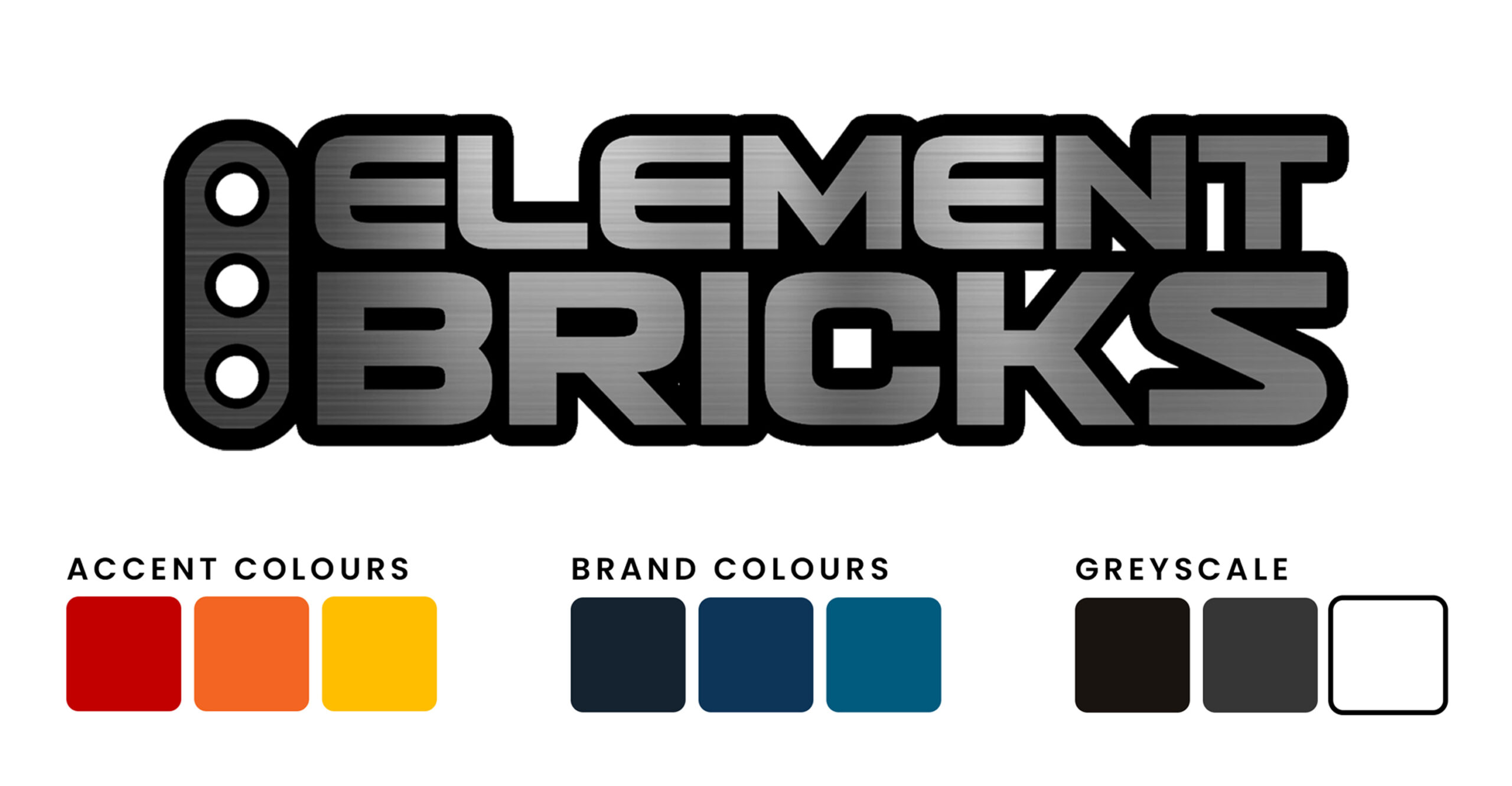
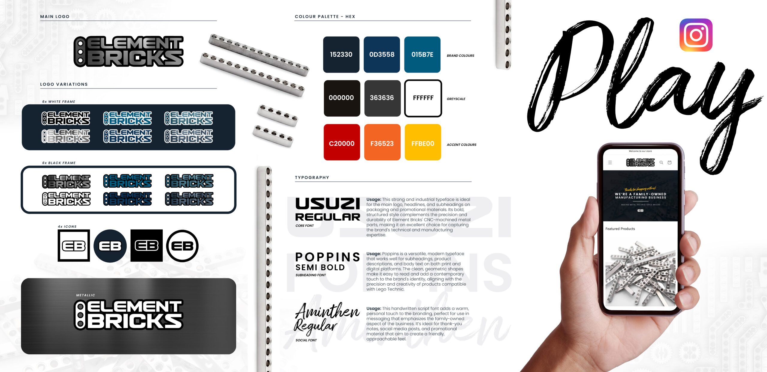
The Element Bricks logo system is a masterclass in precision branding—engineered to reflect the company’s values of durability, technical excellence, and family-owned authenticity.
Logo Design
The core logo integrates industrial elements directly into the letterform, using a technic beam-inspired icon to reinforce the product line and customer base. The bold, geometric style of “ELEMENT BRICKS” instantly communicates strength, structure, and mechanical precision—making it the ideal visual for a manufacturer of CNC-machined metal parts compatible with Lego Technic.
Colour Scheme
The brand palette is clean, confident, and purposeful:
-
Cool, Metallic Blues reflect industrial quality, trust, and technical sophistication.
-
Black, White & Greys create strong contrast for high readability and timeless versatility across print and digital mediums.
-
Vibrant Accent Colors offer controlled energy and attention, perfect for callouts, buttons, and limited-edition runs—adding a modern, playful edge without sacrificing professionalism.
Brand Flexibility
This design system scales flawlessly across media. From icon variations for social platforms and stickers, to the metallic logo for high-end packaging, every version maintains clarity and impact. It’s a modular, robust brand just like the products it represents.
Why it works:
This brand identity doesn’t just look good—it functions like a high-performance product. Every detail, from the iconography to the font pairings, reflects the company’s dual identity: precision manufacturing meets playful innovation. Whether you’re a die-hard LEGO builder or an industrial buyer, Element Bricks now looks like the serious, community-rooted brand it truly is.
This is more than a logo.
It’s a visual promise.
LOCAL BUSINESS BRANDING
Brand Identity & Logo Design
Business Brand Overview
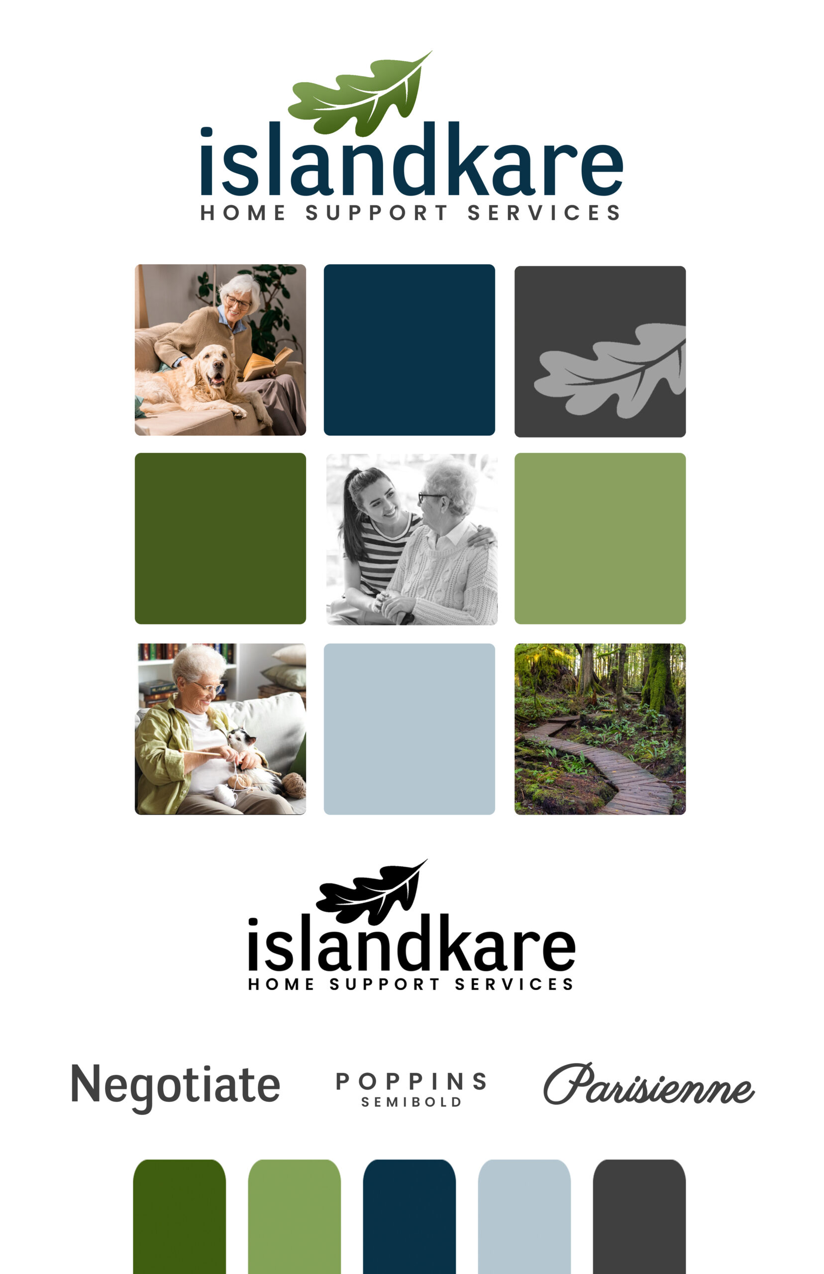
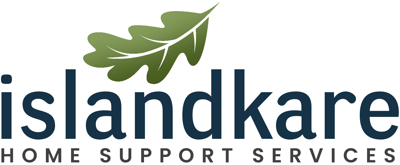
IslandKare is a home support services provider serving the Vancouver Island region, focused on helping seniors age with dignity, comfort, and independence. This brand identity was designed to evoke a deep sense of trust, compassion, and natural care—reflecting both the human touch of caregiving and the rootedness of west coast living.
Why This Logo Design Works
This branding system blends compassionate care with coastal professionalism. It resonates deeply with:
-
Family decision-makers seeking home care
-
Elderly clients who value dignity and respect
-
Healthcare professionals looking for dependable referrals
The natural elements reinforce emotional connection, while the structured fonts and colors build brand trust and recall.
A Brand That Balances Nature & Nurture
The IslandKare logo brings warmth and clarity together in a professional mark.
-
The oak leaf icon is more than decorative—it symbolizes strength, care, and deep roots, perfectly suited for a company supporting elders in their home environment.
-
The modern lowercase wordmark communicates humility, calm, and approachability, while the clean sans-serif type adds an air of professionalism and trustworthiness.
Whether used on uniforms, signage, or business cards, this brand mark feels equally at home in nature and in the home.
Typography That Builds Trust and Establishes a Human Connection
-
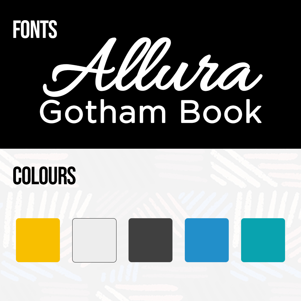
Allura is a handwritten script that conveys personal care, making Mary Ann feel approachable and relatable—an essential quality for anyone in the insurance industry.
-
Gotham Book brings structure and clarity to the name, reinforcing her credibility and making key information easy to digest.
This font pairing supports a brand voice that is both compassionate and competent—two qualities clients seek in a financial advisor or insurance expert.
Design That Reflects Care & Commitment
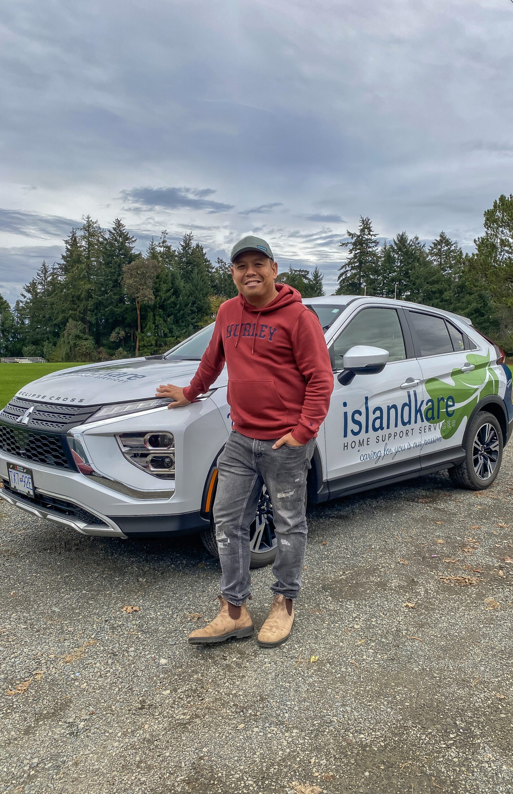
At BTTR Marketing, we believe great branding should feel like home—especially when your clients are trusting you to support their most vulnerable family members. The IslandKare identity delivers on both form and function, positioning the brand as a trusted companion in senior home support services.
📞 Ready to build a brand rooted in care?
Book your free consultation today.
You shouldn’t be doing the marketing stuff.
Personal Branding &
Logo Development
Project Overview
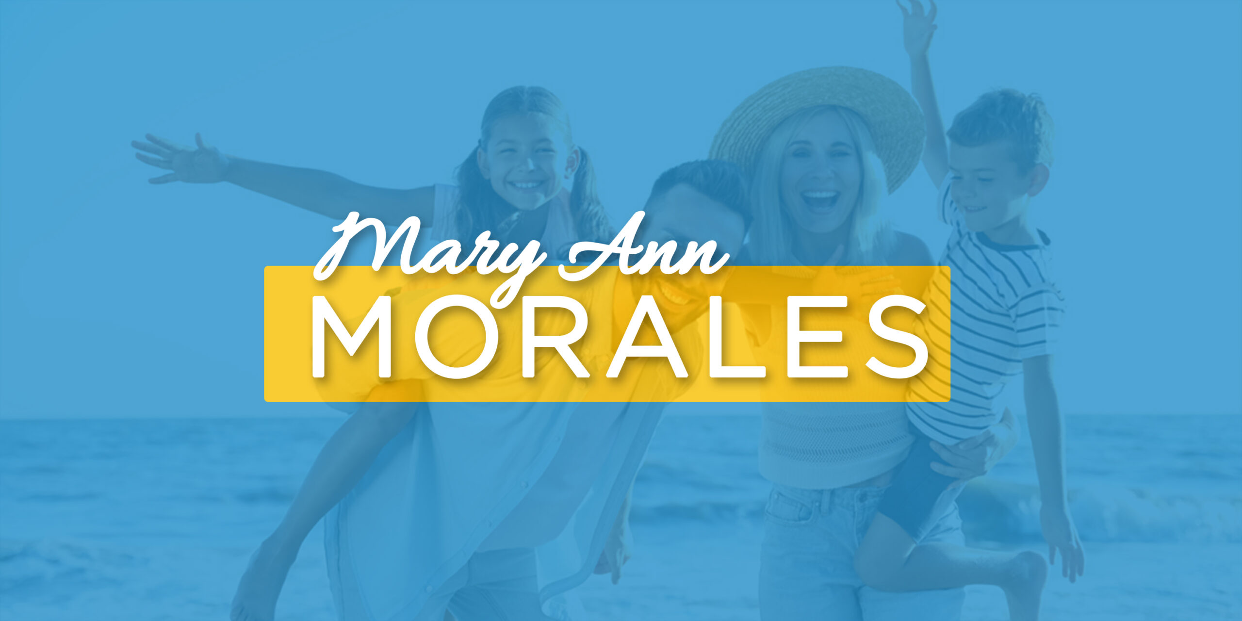
For this branding project, we crafted a visual identity for Mary Ann Morales, a trusted insurance agent who supports families in protecting what matters most. The brand had to strike a perfect balance—professional enough to reflect the responsibility of her role, yet warm and human enough to connect with everyday families.
Why This Design Works
This brand identity is more than beautiful—it’s built to convert trust into action. It communicates:
-
Approachability through soft script
-
Authority through modern structure
-
Confidence and care through vibrant, balanced colour
All while subtly positioning Mary Ann as a dependable guide in the world of insurance and financial protection.
Logo Application & Brand Versatility
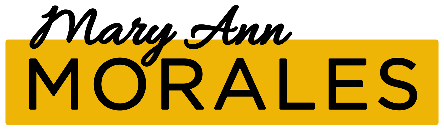
The logo suite was developed with flexibility in mind. The circular “M” monogram is ideal for social media, email signatures, and digital business cards—while the full name logo commands presence on her website, slide decks, and professional documents.
Whether she’s connecting with young families, professionals, or retirees, the brand scales with ease across all platforms.
Typography That Builds Trust and Establishes a Human Connection
-
Allura is a handwritten script that conveys personal care, making Mary Ann feel approachable and relatable—an essential quality for anyone in the insurance industry.
-
Gotham Book brings structure and clarity to the name, reinforcing her credibility and making key information easy to digest.
This font pairing supports a brand voice that is both compassionate and competent—two qualities clients seek in a financial advisor or insurance expert.
You’re not a graphic designer… we are.
OTHER LOGOS WE’VE DESIGNED